Choose any preexisting line of packaging, preferably ones that have different sizes, colors, or varieties of the product. The challenge was to improve the visual representation of the brand, as well as enhance the appeal and understanding of what the product is to the consumer.
The project must include at least 4 design variations that will be displayed on the planned packaging.
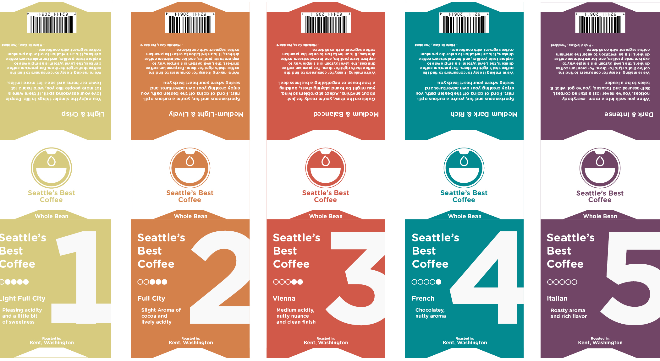
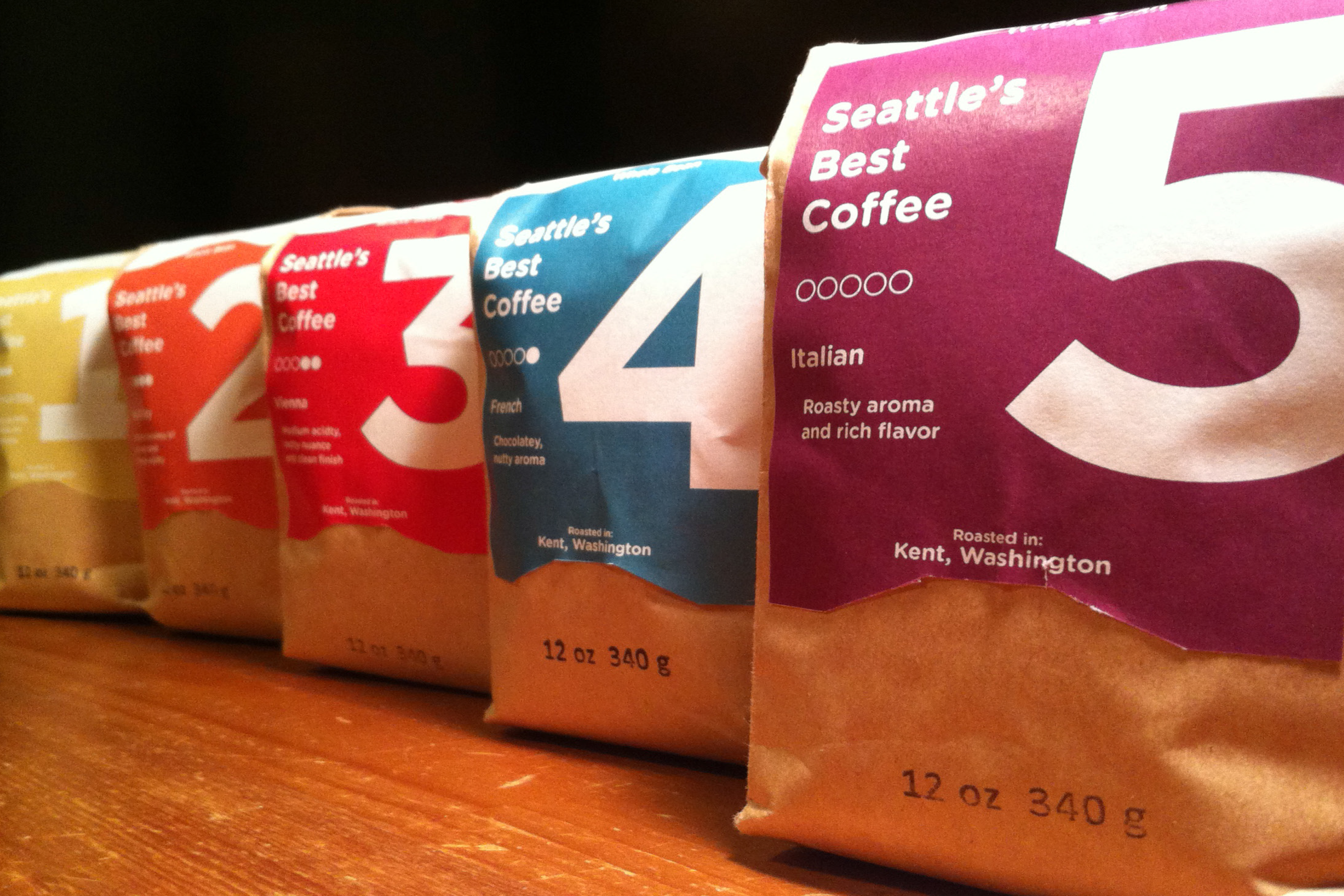
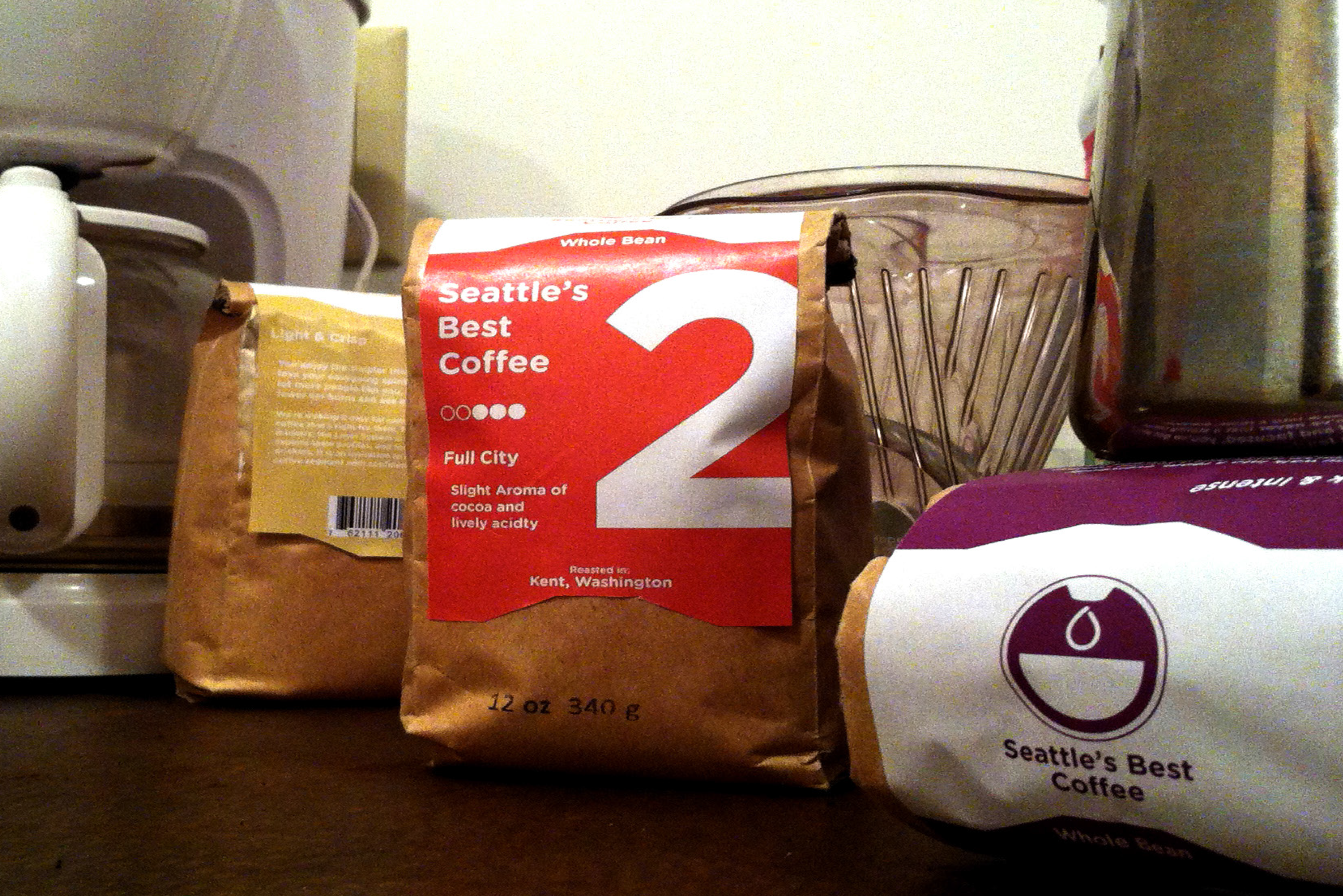
I choose to redesign Seattle’s Best Coffee’s packaging, who had ironically just gone through their own repackaging. Their newest design looked like it could be any product. What I wanted to do was take the idea they planned for their new design, a simple and easy way to choose your preferred type of coffee and quickly.
To do this, I choose 5 different colors increasing in dark hues from a beige to a dark purple to represent the most common five different roasts. I also wanted to come up with a design that made differentiating between the different roasts happen in just a glance.